
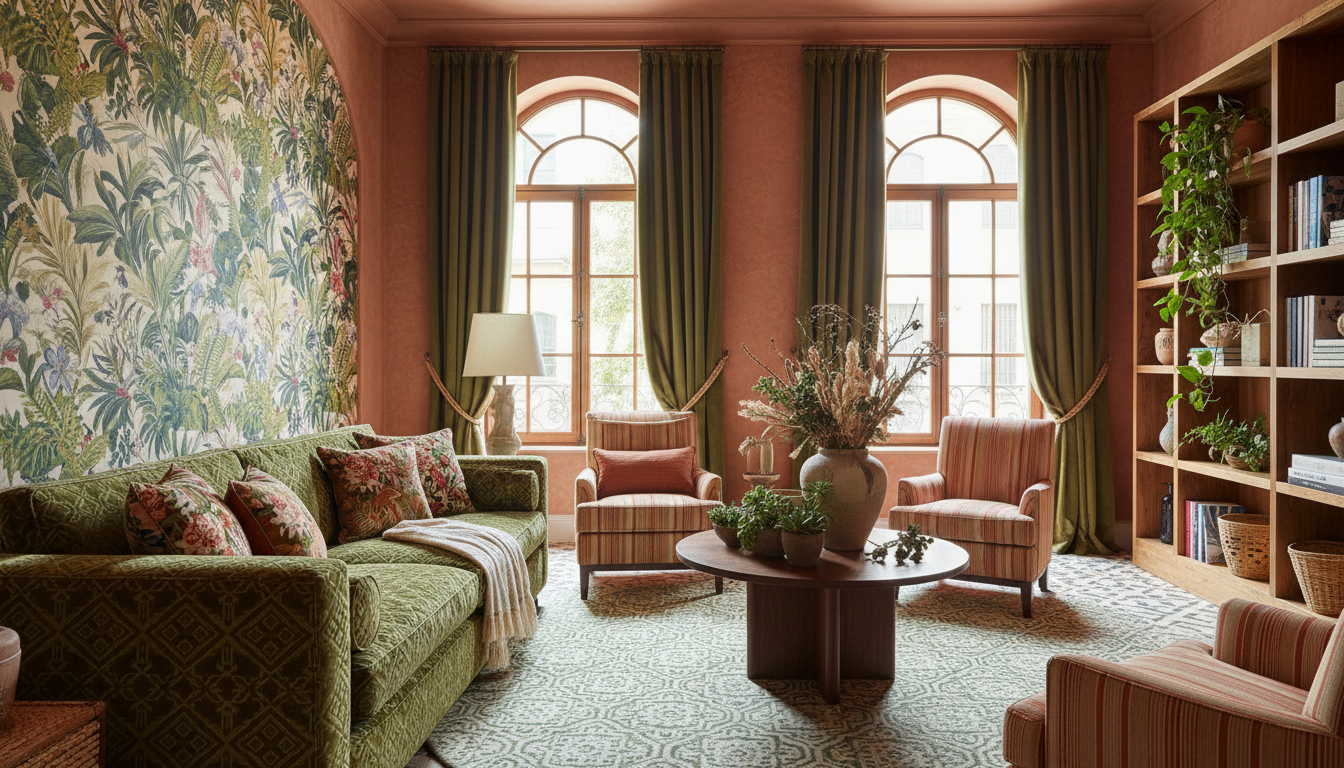
Bold patterns home decor is having a moment—and it’s a decisive rejection of the all-white, spare aesthetic that dominated living rooms for the past decade.
Nearly two-thirds of homeowners are now considering patterns for their interiors, according to design trend data. What began as a whisper of dissent against minimalism has become a roar. Interior painting requests alone have jumped over 30% year-on-year, signalling that people are ready to make colour commitments.
The shift is real enough that design culture has started naming it: “Printplosion” and “Dirtcore.” These aren’t twee marketing terms invented by lifestyle magazines alone. They represent an actual swing in how people want to live—noisier, warmer, more tactile.
The Rise of Printplosion
Printplosion sounds exactly like what it is: patterns everywhere, unapologetically layered. Florals. Botanicals. Geometric prints mixed with stripes. Wallpaper on one wall, patterned upholstery on another. The logic is maximalist rather than restrained.
This runs counter to a 15-year trend toward whitewashed walls and unadorned surfaces. Younger homeowners especially seem exhausted by the aesthetic austerity. They grew up on Instagram feeds of identical Scandinavian interiors and are now actively seeking the opposite: visual richness and personality.
The patterns trending now aren’t dainty. They’re bold and graphic. Florals work, but oversized ones. Botanicals with real botanical accuracy—ferns, pampas grass, wildflower spreads. Mixed patterns layer without descending into chaos because they share similar colour families.
## Understanding Dirtcore and Earthy Tones
If Printplosion is the pattern movement, Dirtcore is the colour movement. The palette reads like an earth science lesson: browns, clay, terracotta, moss, ochre, muddy greens.
These are not the beiges of the 2010s. Those felt defensive and neutral. Dirtcore colours feel intentional. They’re warm without being cheerful. They evoke soil, clay pots, natural fibres. They make a room feel inhabited and grounded.
Terracotta walls paired with moss-green upholstery. Ochre accents against muddy brown cabinetry. These combinations work because they’re all fighting for the same atmospheric space—warmth, earthiness, a sense of being rooted. There’s no clash because the colours share a common DNA.
The colour shift is practical too. Earthy tones hide dust and wear better than white. They feel less sterile in Indian homes, where the light is often intense and warm. They complement natural wood furniture without competing for attention.
Whimsigoth: Velvet, Jewel Tones, and Celestial Motifs
Alongside Dirtcore sits another trending aesthetic: whimsigoth. This blends whimsy with gothic sensibility. It pulls in velvet textures, jewel tones (emerald, sapphire, deep purple), and celestial motifs—moons, stars, cosmic imagery.
This trend appeals to a different demographic than pure Dirtcore, but they’re united in rejecting minimalism. Whimsigoth says you can be romantic and dark simultaneously. It says your home doesn’t need to apologise for being expressive.
According to real estate trend analysis, the whimsigoth aesthetic is affecting property appeal in surprising ways. Homes styled with these elements are standing out in competitive markets. They have personality. They’re memorable.
Why Minimalism Is Losing Ground
The minimalist movement wasn’t wrong—it solved real problems. Clutter exhausted people. Blank walls felt calming. White everywhere meant fewer decisions.
But 15 years of that created fatigue. Homes started looking identical. Social media fed the homogeneity. And younger homeowners, having grown up in that visual landscape, are consciously rejecting it.
There’s also an economic factor. As housing remains expensive, people are spending more time at home. A blank wall that felt soothing during a 20-minute evening wind-down feels depressing when you’re working from home. Bold patterns and earthy tones create richness. They reward looking at.
Making Bold Patterns Work
The jump from minimalism to Printplosion feels risky. Many homeowners worry about overwhelming spaces or dating their interiors too quickly.
The trick is restraint within abundance. You can’t pattern every surface. Choose one dramatic focal wall. Wallpaper it with an oversized floral or botanical print. Let adjacent walls remain solid but in a coordinating earthy tone.
Layer patterns strategically. A patterned area rug grounds seating. Patterned throw pillows add texture without requiring permanent commitment. Patterned curtains frame windows. Each adds visual interest without creating sensory overload.
Colour cohesion matters too. Keep your palette contained. Five or six colours maximum. Brown, terracotta, moss, cream, ochre, black. Everything else is variation. This prevents chaos.
Practical Steps for Your Home
Start with paint. That 30% increase in interior painting requests exists because paint is the fastest, cheapest way to shift a room’s energy. Roll out a terracotta accent wall in your living room. Paint your bedroom in soft moss. These changes cost less than new furniture and create immediate impact.
Wallpaper one wall in your entryway or bedroom. It’s removable. It’s reversible. It commits you without committing you forever.
Hunt for patterned upholstery secondhand. Vintage markets and online resale platforms overflow with patterned sofas, chairs, and ottomans from the 70s and 80s—eras when pattern abundance was normal. These pieces cost less than new minimalist furniture and carry character.
Textiles matter. Layer patterned throws, cushions, and rugs. These are the easiest way to test drive bold patterns before making structural changes.
FAQ
Q: Will bold patterns and earthy tones feel dated quickly?
A: Earth tones have remained aesthetically relevant for centuries. These colours appear in classical art, colonial interiors, and traditional design worldwide. They age slower than trend-specific palettes. Patterns matter more for dating—geometrics from the 60s read differently than botanicals from now—but botanical and floral patterns have also cycled through history repeatedly.
Q: How do I stop bold patterns from making my home feel smaller?
A: Pattern actually creates visual interest that can make spaces feel larger because the eye travels rather than settles. Avoid patterns on every surface. Keep ceilings and at least one wall solid. Use white or cream as breathing room between patterned elements. This maintains visual complexity while preserving openness.
Q: Can I combine Dirtcore and Whimsigoth?
A: Absolutely. Use earthy tones as your base—walls and larger furniture in terracotta, brown, moss. Then layer jewel-tone accents and velvet textures through smaller elements: a jewel-toned throw, a celestial-patterned cushion, brass or gold accessories. The earth tones ground the whimsy.
Q: Is interior painting expensive?
A: Professional painting costs vary, but a single room typically runs between ₹10,000–₹30,000 depending on size and surface condition. Paint itself is inexpensive. If you’re comfortable with a brush, DIY painting costs under ₹3,000 for materials. It’s the most affordable way to shift your interior significantly.
Q: Where do I find patterned fabrics and furnishings?
A: Vintage markets, online resale platforms (OLX, Facebook Marketplace), and secondhand furniture stores stock patterned pieces affordably. New patterned upholstery is available through mainstream furniture retailers, though often at premium prices. Textile shops sell patterned fabric by the metre for custom upholstery projects.
