
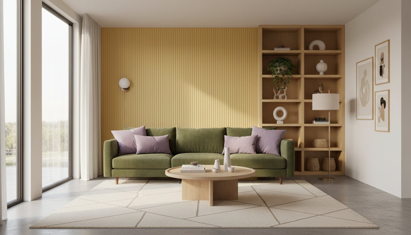
Food-inspired home decor colors like matcha green and ube purple are reshaping how people design their living spaces far beyond the kitchen. What began as a culinary fascination has spilled into the furniture showroom, the electronics store, and the paint aisle. Brands are now coating everything from refrigerators to sofas in hues drawn straight from the pantry.
The shift reflects a broader cultural moment. Contemporary food culture has become deeply embedded in design choices. Colours borrowed from matcha lattes, dragon fruit, cherry jam, and butter don’t just look appealing on a screen—they carry emotional weight. They evoke memories of taste and texture. They signal comfort, nostalgia, and care.
Background
The roots of this trend run deeper than Instagram aesthetics. Food has always held symbolic meaning in interior spaces. What’s new is the scale and the reach. Five years ago, a matcha-coloured wall might have felt niche. Today, it’s mainstream enough to find matcha-inspired paint lines at major retailers and matcha-green headphones in electronics sections.
According to reporting on food colours in home decor, matcha green, butter yellow, cherry red, and dragon fruit pink are leading the charge. These aren’t random selections. Each colour connects to a broader narrative about wellness, nature, or indulgence.
The “sugar drenching” trend has given this movement a name and a philosophy. Sugar drenching uses food-inspired paint colours to create spaces that feel emotionally safe and secure. The concept borrows from comfort culture—the same impulse that drives people to soft furnishings, warm lighting, and cocoon-like interiors during colder months. It’s about wrapping yourself in colour that makes you feel held.
Food-inspired home decor colors spreading across product categories
Matcha isn’t just on walls anymore. Kitchen appliance makers have launched matcha-green blenders and coffee makers. Furniture brands offer matcha-upholstered sofas and accent chairs. Tech companies have introduced matcha-coloured earbuds and phone cases. The colour has become almost a shorthand for calm and wellness.
Ube—the deep purple of Filipino yam desserts—has followed a similar arc. What started in Filipino bakeries has become a global colour phenomenon. Ube-purple throw pillows sit next to ube-toned desk lamps in living rooms. Home decor retailers stock ube-coloured storage boxes and decorative accessories.
Butter yellow brings warmth and optimism to spaces. Dragon fruit pink adds a playful, contemporary edge. Cherry red grounds a room in sophistication or fun depending on how it’s deployed.
These aren’t arbitrary choices by designers. Each food-inspired hue carries associations. Matcha suggests health, nature, and Japanese minimalism. Ube speaks to heritage, playfulness, and comfort desserts. Butter yellow evokes richness and generosity. The colours sell an emotional story, not just a visual one.
What this means for Indian homes
Indian homes have long embraced colour in ways Western design has only recently caught up with. Jewel tones, warm earth shades, and bold accent walls are familiar territory for many Indian interiors. Food-inspired palettes fit naturally into this sensibility.
The trend matters practically for Indian shoppers now seeing these colours in local and online stores. Matcha-green paint is increasingly available from Indian retailers. Ube-inspired furniture appears in both traditional and contemporary Indian home shops. Electronics brands selling in India have begun offering food-inspired colour options.
The appeal is clear: these colours align with Indian aesthetic preferences for warmth, richness, and emotionally resonant design. They also suit the Indian climate well. Warm, saturated food-inspired colours work well in spaces that receive strong natural light. Matcha green remains cooling and calming even in summer heat. Butter yellow brightens without overwhelming.
For renters, food-inspired decor colours offer flexibility. Rather than committing to a full wall repaint, you can introduce matcha or ube through textiles, furnishings, and accessories. This is particularly valuable in Indian rental markets where wall changes may not be permitted.
How to introduce food-inspired colours into your home
Start small. A matcha-green accent chair or ube throw pillows test the colour in your space without major commitment. Observe how natural light in your room interacts with these saturated hues throughout the day.
Paint is the boldest move. A single feature wall in matcha or butter yellow can anchor a room. Pair it with neutral furnishings to let the colour breathe. Food-inspired colours are assertive; they work best when given breathing room.
Mix food-inspired hues thoughtfully. Matcha green and cherry red can clash if both are fully saturated. One should dominate; the other should appear as an accent. Butter yellow and ube can work together if one is muted or appears in smaller quantities.
Consider where these colours will be most effective. Living rooms and bedrooms suit calm, grounding food colours like matcha. Kitchens and dining areas naturally accommodate richer food hues like cherry red or ube. Home offices benefit from focus-enhancing matcha or energizing butter yellow.
As reported earlier on home design trends for 2026, warmth and emotionally grounded interiors are leading the way. Food-inspired colours align perfectly with this broader shift toward comfort-focused design.
Why food-inspired colours resonate emotionally
These aren’t neutral shades. They carry sensory associations. When you live with matcha green surrounding you, your brain connects the space to calm, wellness, and Japanese ritual. Ube evokes indulgence, tradition, and happiness. Butter yellow speaks to generosity and comfort.
This emotional dimension explains why food-inspired colours feel different from standard paint chips. They tap into memory and desire. They make homes feel less like showrooms and more like deeply personal spaces.
The trend also reflects changing relationships with food in contemporary culture. Food has become more visible, more celebrated, more integral to identity. It makes sense that it would migrate into the fabric of home design. Your decor now tells a story about what you value: wellness, heritage, comfort, sustainability, or playfulness—depending on which food-inspired palette you choose.
Key takeaways
- Food-inspired home decor colours like matcha green, ube purple, and butter yellow now extend far beyond kitchens into furniture, electronics, and paint schemes
- The “sugar drenching” trend uses these food-inspired colours to create emotionally secure and comforting home spaces
- These saturated, food-associated hues work well in Indian homes and suit the local climate and aesthetic preferences
- Start with small pieces—pillows, accessories, or a single accent wall—to test food-inspired colours before fully committing
- The trend reflects broader shifts toward warmth and emotional resonance in contemporary interior design
FAQ
What exactly is the sugar drenching trend?
Sugar drenching is the practice of using food-inspired paint colours to create spaces that feel emotionally safe and comforting. Rather than neutral or cool tones, these paint shades are drawn from food—matcha, butter, ube, cherry—to create homes that feel nurturing and secure.
Will food-inspired colours go out of style quickly?
These colours have staying power because they’re grounded in emotional connection rather than fleeting fashion. However, like all trends, intensity may shift. Rather than disappearing, food-inspired palettes will likely become more integrated into standard design options rather than feeling like a distinct “trend.”
Which food-inspired colours work best in Indian homes?
Matcha green works well in most Indian spaces because it’s calming and flatters in strong sunlight. Butter yellow adds warmth to spaces that need brightening. Ube can feel bold; use it sparingly as an accent unless your space has substantial natural light. Cherry red suits formal living areas and works beautifully with traditional Indian furnishings.
Can I combine multiple food-inspired colours in one room?
Yes, but carefully. One food-inspired colour should dominate (appearing on walls or large furniture). The second can appear as an accent through textiles or smaller pieces. Avoid using multiple fully saturated food colours; the room can feel chaotic. Pair dominant food hues with neutrals to create balance.
Where can I find food-inspired home decor colours in India?
Major paint retailers now stock matcha and butter-inspired shades. Online furniture stores and appliance retailers increasingly offer these colours. High-street home decor shops in major Indian cities carry ube-inspired and other food-inspired accessories. As the trend grows, availability will increase across price points.
Also read
- Burrowcore Interior Design Is Autumn 2026’s Cosiest Home Trend—Here’s How to Create One
- Why Indian Kitchens Are Trading In Their Toasters for Multi-Functional Countertop Ovens
